Product design · 2021 – 2023
TD Auto Finance Customer Portal
The portal where TD's auto loan customers pay their loan, track the balance and manage the account.
It ranked 13th of 24 lenders, and the website was the outlier.
53% to 93%Weighted task success
9.2 to 3.4Clicks to make a payment
I owned interface design for account and payment tasks, responsive behavior and handoff. Mad*Pow supported research and the engagement's design principles.
- Role
- Product Designer
- Engagement
- via Cognizant
- Research
- with Mad*Pow
- Year
- 2021 – 2023
On this page
Why the portal had to change
13thof 24 lenders
Auto loan customers rating their own lender out of 1,000, in J.D. Power's independent 2022 study of 24 lenders.
Strong everywhere the business met customers. The website was the outlier.
| Factor | vs. average | score |
|---|---|---|
| Application and approval | +34 | 871 |
| Phone customer service | +14 | 853 |
| Billing and payment | −5 | 845 |
| Website experience | −28 | 833 |
- Seven years of best-in-class tools built for dealers.
- Chase, Ally, BofA and Capital One had auto buying, pre-approval and refinancing. TDAF had none.
- Anyone who could not serve themselves called support instead.
What customers said in the same study, the strongest of sixteen
2 complaints about Self-service
- No autopay while still making extra payments
- Wants an amortisation schedule
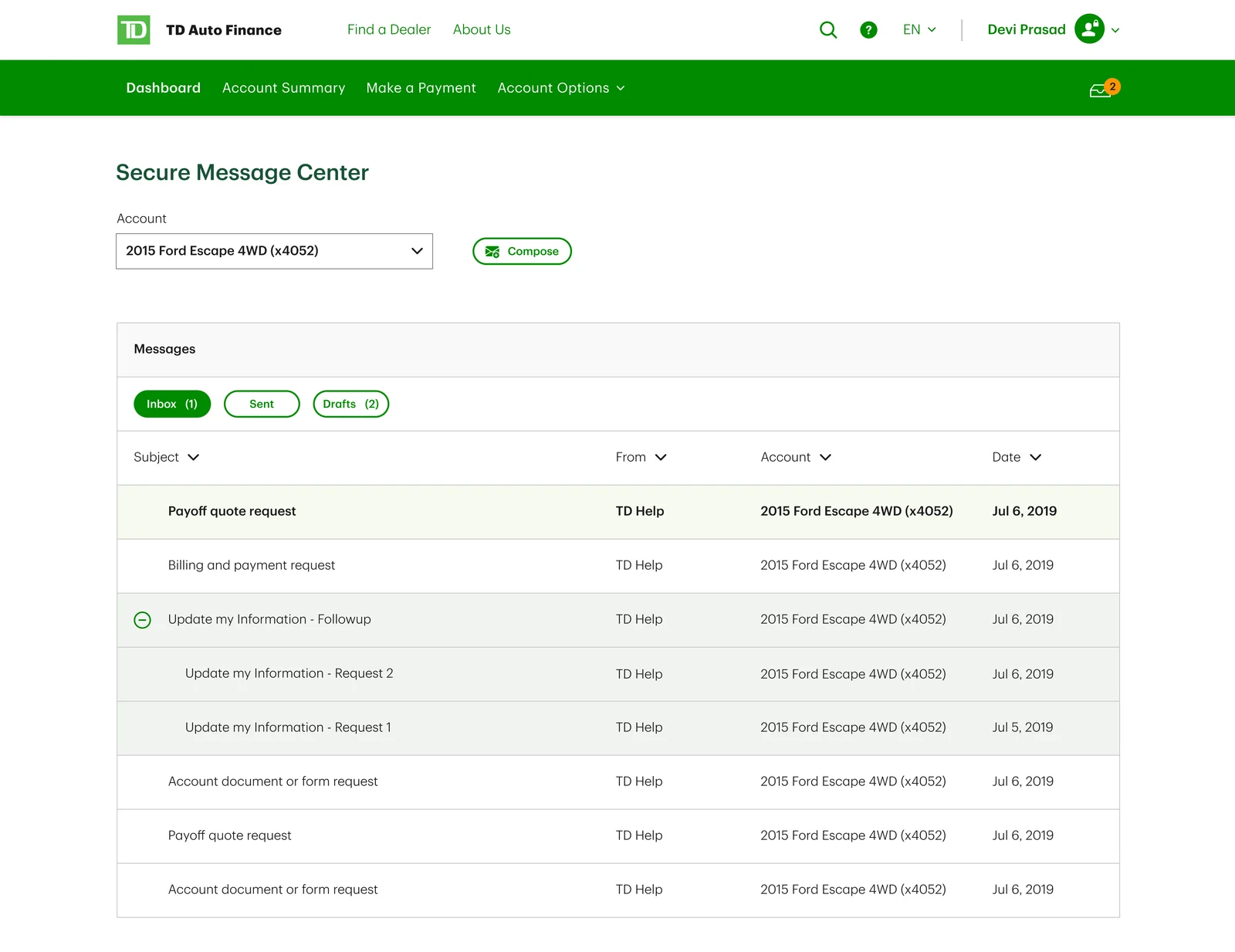
What shipped: Due date changes, extensions, statements and secure messages, designed as tasks that no longer need a phone call.
2 complaints about Fewer steps
- Reduce number of clicks to pay my bill
- Complicated to navigate through
What shipped: Paying a bill went from 9.2 clicks to 3.4.
2 complaints about Look and feel
- Small type, stuff crammed on there
- Outdated, not user friendly
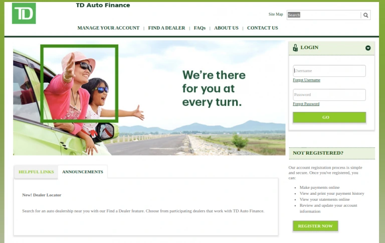
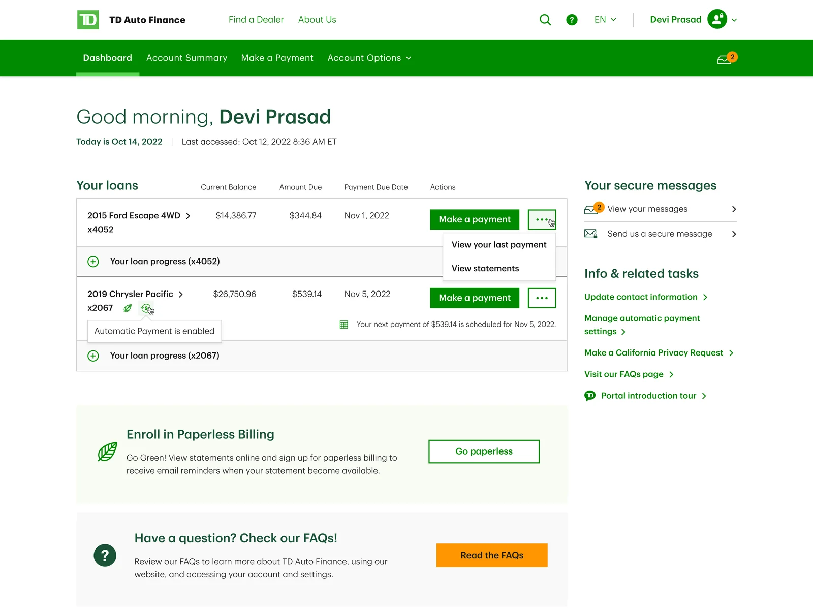
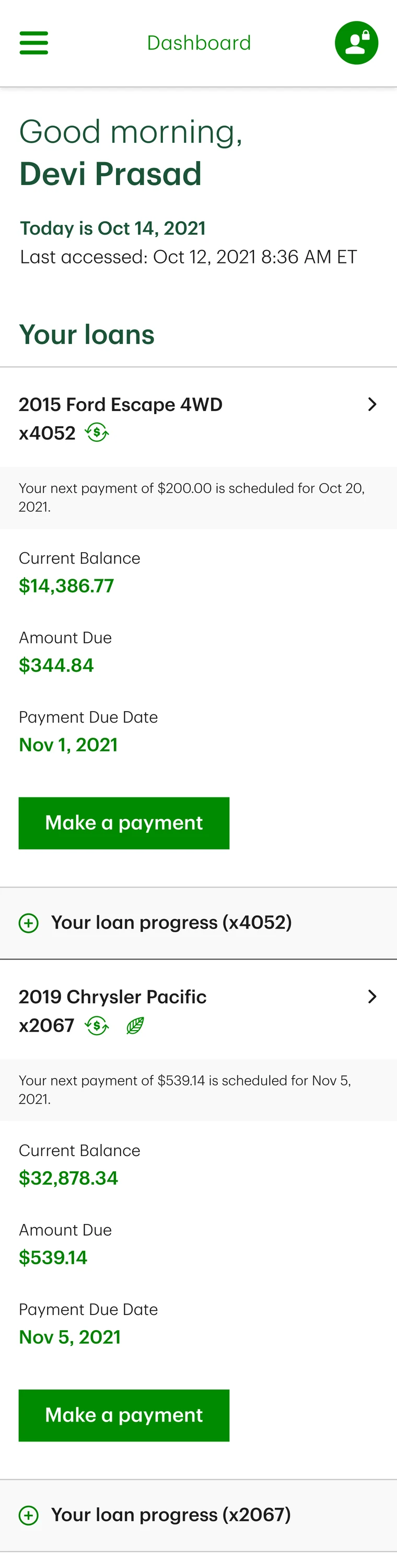
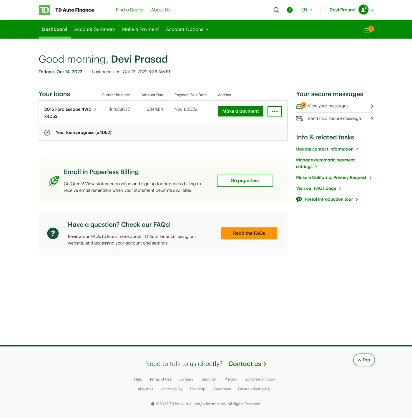
What shipped: The landing page went. A dashboard with the loan, the amount due and the payment button replaced it.
1 complaint about Plain language
- Explain what the payment options mean
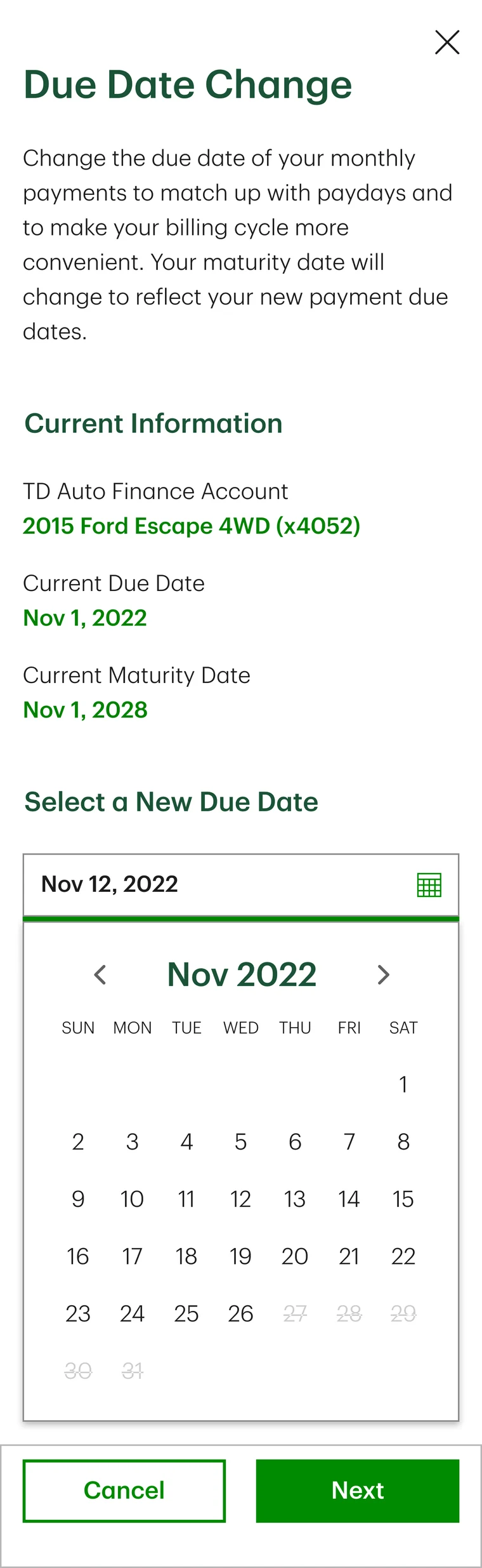
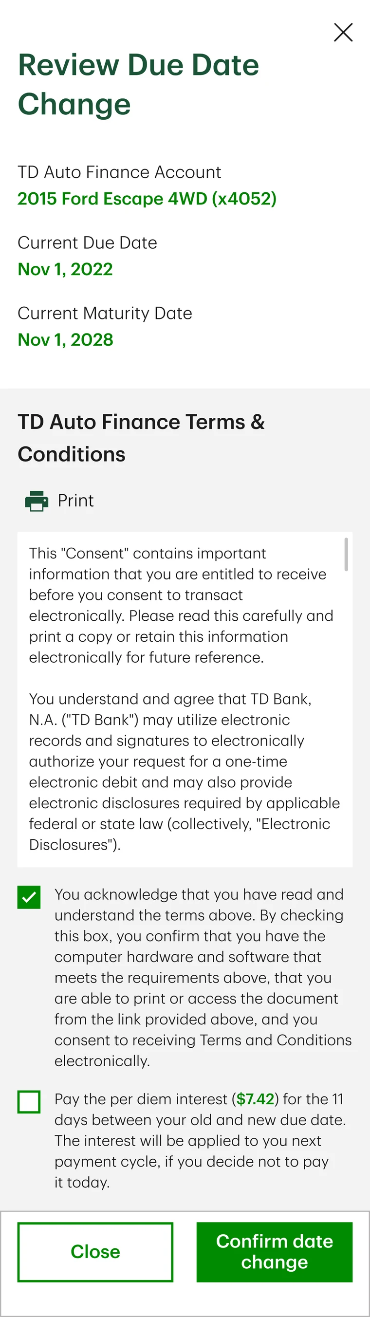
What shipped: The cost of moving a due date is printed on the review step, in dollars, before the customer commits.
Decisions
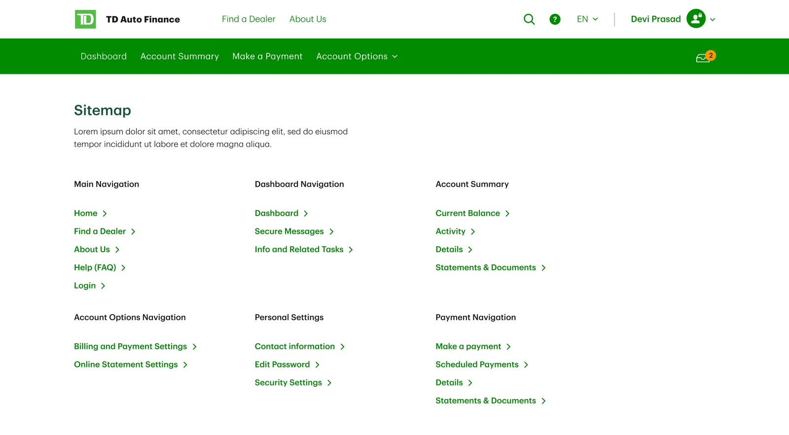
The site was grouped by what customers came to do, not by TD's product lines.
- Because
- The complaints were about tasks: pay, change a date, find a statement. A customer with a car loan does not arrive thinking in product lines, and a site organised by them made every task a search.
- What it cost
- The product lines lost their own front door. The site had to be argued for as one place, and the marketing surface gave way to the tasks.
The landing page became a dashboard: the loan, the amount due, the payment button.
- Because
- Everything a customer came to do sat behind the login, listed as a reason to register. Paying the bill was the task, so the first screen after login is the bill.
- What it cost
- There was less room to sell. The checking account offer that sits under the loan tasks is what survived of that, and the reflection below says what I think of it.
Transparent over tidy: the cost of moving a due date printed in dollars on the review step, and the dates the loan cannot move to struck through rather than hidden.
- Because
- Two of the sixteen complaints were about not understanding what an option meant. A cost shown before the commit is a decision the customer makes; a cost found on the statement is a call to support.
- What it cost
- A busier review step, and a calendar that shows what cannot be done as well as what can.
The phone got its own flows, not a reflow of the desktop.
- Because
- The menu and the due date change do not survive being squeezed. A task that works at the small breakpoint is a different task, and the phone is where most bills get paid.
- What it cost
- Two designs to keep in step, and every one of the twelve patterns specified with its responsive rules rather than once.
The payment confirmation step was tested rather than argued.
- Because
- I had reduced the payment flow from 9.2 clicks to 3.4, and IT wanted a confirmation on every payment action, which would have put one back. Putting it in the prototype settled it on evidence.
- What it cost
- A round of testing spent on a step I did not believe in. It made nobody more confident, and the modal did not ship.
Outcomes
- Prototype testing53% to 93%Weighted task successBlind moderated testing, baseline against prototype
- Post-launch observation9.2 to 3.4Clicks to make a paymentSession replay, first month after launch
- Reported result · method withheld31% to 6%Task abandonmentMethod withheld under NDA
- Delivered scope15Self-service features shippedPhase 1, 2023. List withheld
- Projected value~$6MMThree-year business caseProjection over three years; not a measured saving.
Evidence note. The figures come from different stages, named on each: prototype testing, the first month after launch, a reported result whose method is withheld under NDA, delivered scope, and a projection. The 9.2 to 3.4 describes the payment task; the baseline flow is not shown.
Thirty interviews ran alongside the benchmark, moderated by Mad*Pow. The engagement is under NDA: where a method, a breakdown or the baseline flow is not shown, that is why.
Contribution
- Structure
- Grouped the site by what customers came to do rather than by TD's product lines.
- Self-service
- Designed the tasks that used to need a phone call: due date changes, extensions, statements and secure messages.
- Failure states
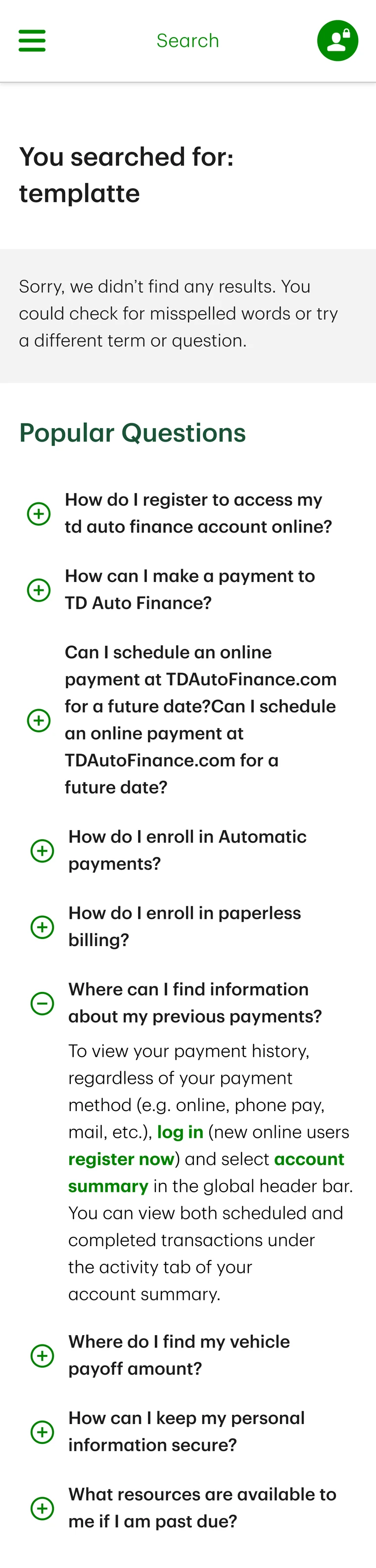
- Designed the cancel, the empty result and the complaint, so a task that went wrong still had somewhere to go.
- Mobile
- Gave the phone its own answers rather than a reflow. The menu and the due date change flow exist only at the small breakpoint.
- Compliance
- Built the terms consent and the interest disclosure into the review step, so the legal requirements landed inside the task rather than beside it.
- Accessibility
- Designed to the bank's accessibility standards, which set keyboard, screen reader, low vision and photosensitivity as the floor for every task.
- Handoff
- Built twelve patterns inside TD's enterprise design system, with their states and responsive rules specified for engineering.
Reflection
The dashboard carries a checking account offer under the loan tasks. Paying a car bill is not a moment anyone is shopping, and I designed it in anyway. Next time the task a customer came for gets an argument made for it.